
Why Color Matters in Design
Color isn’t just decoration. It’s one of the most powerful tools you’ll use as a designer. When you understand how colors work together, you’ll create designs that actually communicate something. You’ll guide the viewer’s eye exactly where you want it to go.
Before you start throwing colors at your designs, you need to understand the fundamentals. We’re going to break down everything from the color wheel to RGB and CMYK, so you’ll know exactly why certain colors work together and others clash.

The Color Wheel: Your Design Foundation
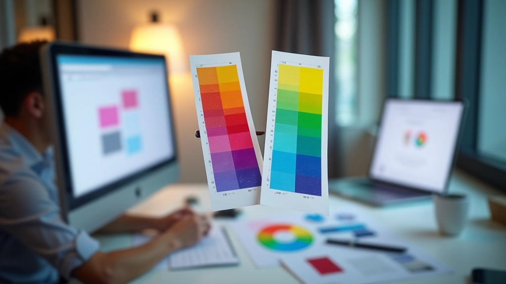
The color wheel is the most essential tool you’ll learn about. It’s not some abstract theory—it’s a practical map showing how colors relate to each other. The wheel contains the 12 main colors: three primary colors (red, yellow, blue), three secondary colors (orange, green, purple), and six tertiary colors that sit between them.
Here’s what makes the wheel useful: once you understand it, you’ll never pick a random color again. You’ll know immediately if two colors are harmonious or if they’ll clash. Most importantly, you’ll understand why certain combinations feel right.
Three Color Relationships You Need to Know
- Complementary: Colors opposite each other on the wheel (like blue and orange). They create high contrast and vibrant designs.
- Analogous: Colors next to each other (like blue, blue-green, and green). They’re naturally harmonious and calm.
- Triadic: Three colors equally spaced on the wheel. Bold and balanced at the same time.

RGB vs. CMYK: When to Use Each
This is the difference that trips up beginners. RGB is light-based—it’s what screens use. When you mix red, green, and blue light at full intensity, you get white. CMYK is pigment-based—it’s what printers use. When you mix cyan, magenta, yellow, and black inks, you get dark colors. These two systems don’t translate perfectly, and that’s why your printed design looks different from what you see on screen.
If you’re designing for screens (websites, apps, social media), use RGB. Every pixel on a monitor is made of red, green, and blue dots. If you’re designing for print (posters, brochures, business cards), use CMYK. Printers can only mix those four inks. The issue? A bright neon blue that looks amazing on your monitor might come out dull in print because CMYK can’t reproduce all the colors RGB can display.
Our advice: always ask your client what the final medium will be before you start. If it’s for print, work in CMYK from day one. Don’t design in RGB and convert later—you’ll waste time fixing colors.
Contrast and Readability: Making Text Pop
Color contrast isn’t just about aesthetics—it’s about making your design actually work. If your text color is too similar to your background color, people literally won’t be able to read it. This is a real accessibility issue, not a design preference.
You’ve probably seen websites where text is barely visible. That’s usually because someone didn’t check their contrast ratio. A good rule of thumb: there should be a noticeable difference between your text and background. Dark text on light backgrounds or light text on dark backgrounds works. Medium gray text on medium gray background? That won’t work.
Good contrast: Dark text on light background
Poor contrast: Hard to read

Practical Tips for Building Your First Palettes
Start with One Color
Pick a main color you love. Then use the color wheel to find complementary or analogous colors. Don’t grab random colors—be intentional.
Limit Your Palette
Three to five colors is the sweet spot. A palette with 10 colors feels chaotic. Constraint forces you to be more creative with what you have.
Use 60-30-10 Rule
60% dominant color, 30% secondary, 10% accent. This creates visual balance. Your dominant color sets the mood, the secondary supports it, and the accent draws attention.
Test Before You Finalize
Look at your color palette on different devices and in different lighting. Print a sample. See how it actually looks, not just on your monitor.
Start Experimenting Today
Color theory isn’t complicated once you understand the basics. The color wheel, RGB vs. CMYK, and contrast—these three concepts will guide most of your color decisions. You don’t need to be a color expert to create designs that work. You just need to understand the principles and practice applying them.
The best way to learn? Start building palettes. Open a color tool, pick a color you like, and use the wheel to find complementary colors. Create a few palettes. Save them. Look at them the next day. Which ones feel right? Which ones feel off? That intuition develops through practice, not theory.
Color is powerful. Use it intentionally, and your designs will communicate better than you ever thought possible.
Educational Disclaimer
This article is for educational purposes and is based on established color theory principles and design practices. While the information provided is accurate and widely used in the design industry, color perception is subjective and can vary based on individual circumstances, cultural context, and personal preferences. The RGB and CMYK information is based on standard digital and print color models, but actual color reproduction may vary depending on device calibration, lighting conditions, and printer specifications. Always test your color choices in the actual medium and environment where they’ll be used before finalizing designs.